Reimagining a startup website
Website rebranding for SmokingDots
Sector
Tech, Startup
Role
Interface design / UX Strategy
Project length
2 months
Project brief
Smokingdots is a full spectrum development company that is focused on web and mobile
development targeted to be a technology arm for anyone. As they were gaining some
traction having worked with a number of reputable clients the company was looking
into the possibilities of updating their brand and website. The current site was not
meeting their expectations and was not providing them with a good way to carry out
sales and attract good potential hires.
Having worked with Smoking Dots before I was brought on to work on the new brand identity and reimagine the website (the rebranding of the logo can be read here) this is the process I took with the stakeholders of smokingDots in order to create the website.
Having worked with Smoking Dots before I was brought on to work on the new brand identity and reimagine the website (the rebranding of the logo can be read here) this is the process I took with the stakeholders of smokingDots in order to create the website.
Initial kick off meeting discoveries
From the majority of the research, I quickly understood that the group of individuals we need to
target is not the sections who do not wanna save it's the individuals who like to save but do
not have a clear way of helping them do it
Why a new website ?
- With the rebrand the site needs to be aligned to the new brand
- Current website does not get many return visits from people
- There are complaints from visitors to the site
- The amount of business coming from the site is quite less
- Current website does not reflect the what the company does properly
- There is no proper direction to the site for different type of visitors
- Proof of work is not provided properly which makes the brand look less trustworthy
- It’s hard to attract potential employees with the current site
Defining the reason for the redesign is key with the client.
It will provide me with insights on the problems of the site, a guideline to define a
successful project and for the client it will be a chance to solidify their needs.
Defining the “Dream website”
Smoking dots dream website should...
- Follow the new branding
- Be easy for the visitor to navigate
- Provide pipelines for different type of visitors to find what they want
- Reflect the values of the company
- Provide ample proof of the capabilities of the company
- Easy call to actions for a visitor from anywhere in the site to reach out
- Be people centric
- support downloadable and sharable content
- Should work as the central point to visit from all the marketing materials
- Show off the process the company follows
- Be something the stakeholders can be proud of
Once the "dream website" is defined with the client we are able to use this as a checklist
to
guide the new design
Analysis of the existing site
To understand the problem of the current website we decided to breakdown the existing site to
understand what are the issues of the current site from a visual perspective and a business
perspective
From a visual Perspective
Readability
Two main issues that can be identified at a glace is the readability of the content of the site
leaves a lot to be desired I broken down the the issues to two main issues
- Color contrast
- Size Contrast
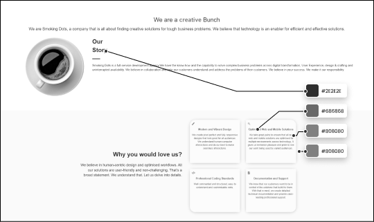
Color contrast
The best way to check the contrast is to turn the design black and white and see what is
readable and what is not.
The colors of the current site are quite close to each other and it’s hard to differentiate the titles and content section which affects the content hierarchy
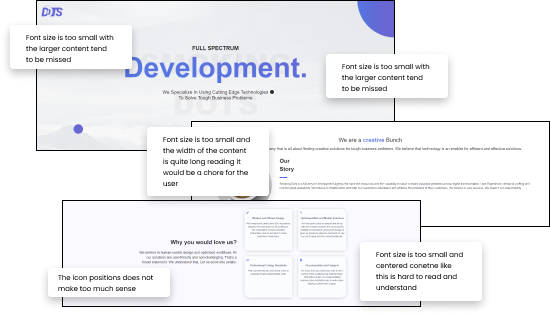
Size Contrast
Size is one of the main ways we can improve the readability of the content There are
multiple places in the current site that has content that is hard to read cause of the font
sizes and how the paragraphs are being broken down.
Relatability
Smokingdots being a company that is focused on tech and people the site need to reflect that but
the current site is failing to relate to that from a visual perspective.
- The header background does not relate to anything of the organization
- The header content message is not relatable
Consistency
There are some places the site feels quite empty and other places the site feels too crammed.
following a proper grid system is a good way to mitigate it.
From a business Perspective
- It is not clear from a first glace what the business is
- There is no platform or information for a potential employee
- A lot of reading is reqired ( not friendly for scanners )
- No pipeline for a potential client to navigate through to know about the business
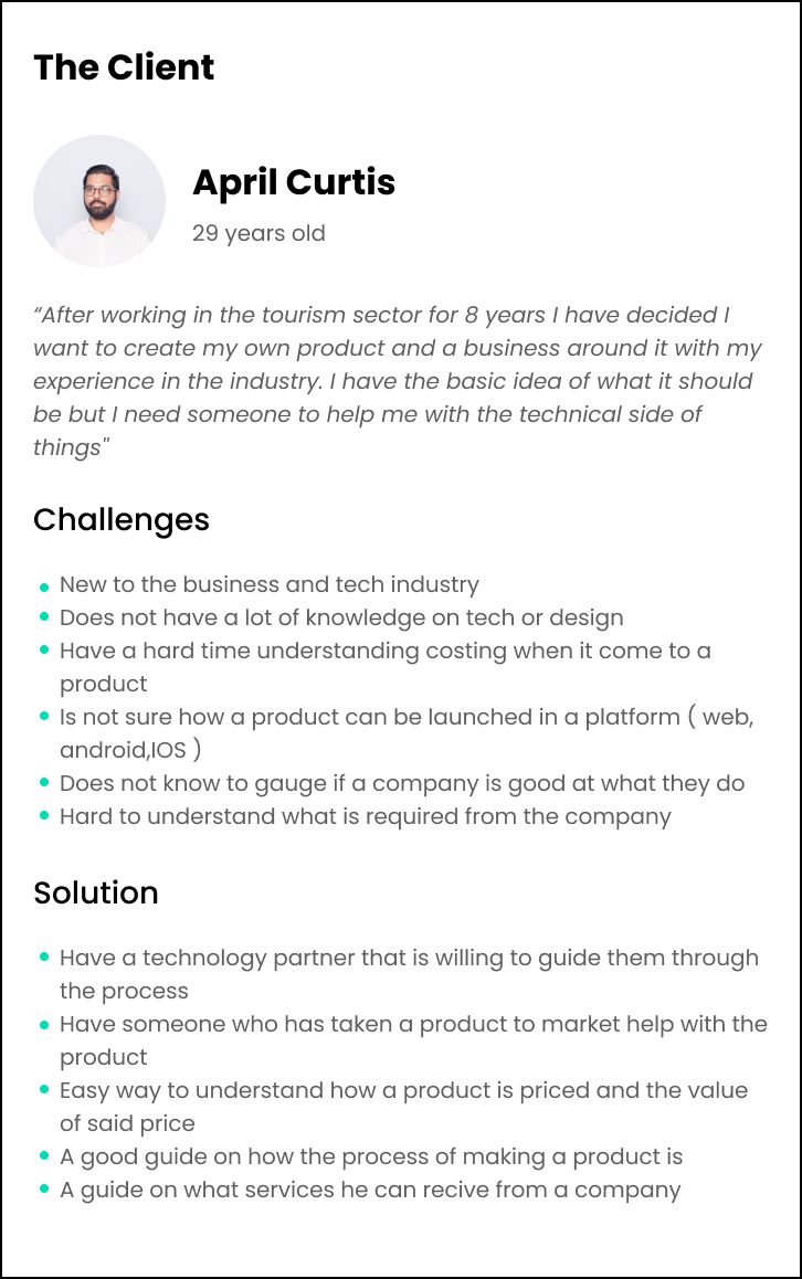
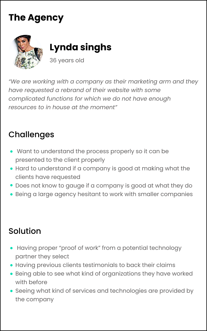
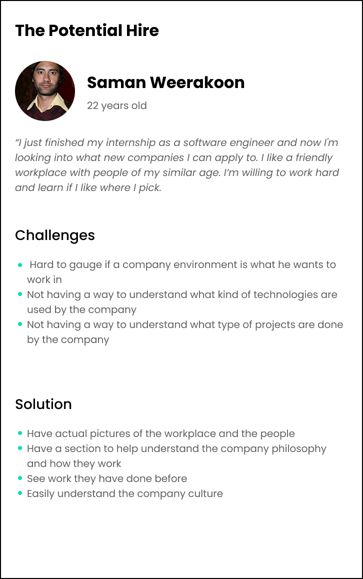
Target user insights
From the meetings with the clients we started noting down every type of vistor we are expecting
to the website from there we managed to group the users down into three manin groups of vistors
- Clients - Clients looking to get something created for them
- Agencies - Organizations that are loooking to outsorce the design and development of a project to a 3rd party on behalf of some other party
- Potential hires- Potential empoyees
Objections and rough site plan
After identifying what the obtention visitor will be looking for from smoking dots we breakdown
the main objections the client will have upon visiting the site
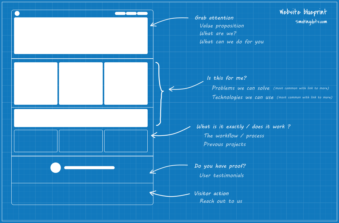
- Is this for me?
- Does it work?
- What is it exactly?
- Do you have proof?
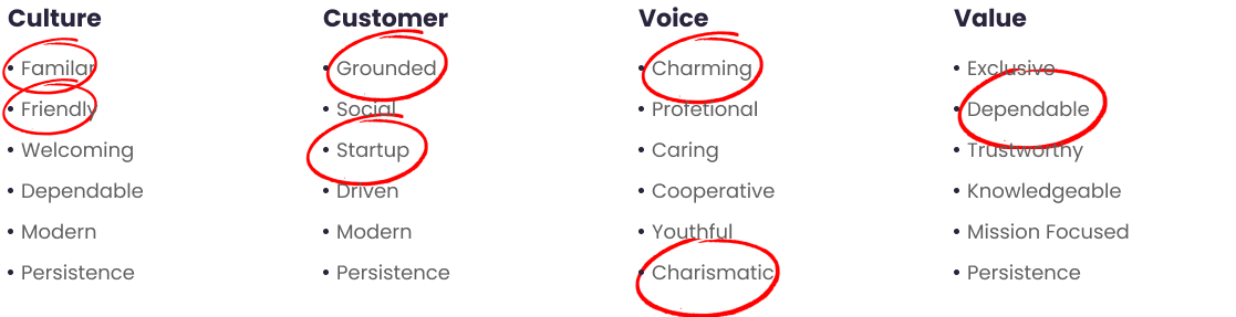
Brand and site language
There are some places the site feels quite empty and other places the site feels too crammed.
following a proper grid system is a good way to mitigate it.
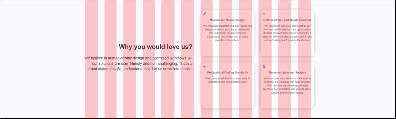
Stylescapes
In order to set the look and feel of the site and brand designs stylescapes were presented to
the client. from the conversations two main stylescapes were selected to be used in the visual
design process.
A stylescape is an opportunity to demonstrate to the client how a brand will look and feel. It's a collection of brand assets – colors, typography, images, language tone, design elements etc. – combined together to provide an overall visual aesthetic of a brand.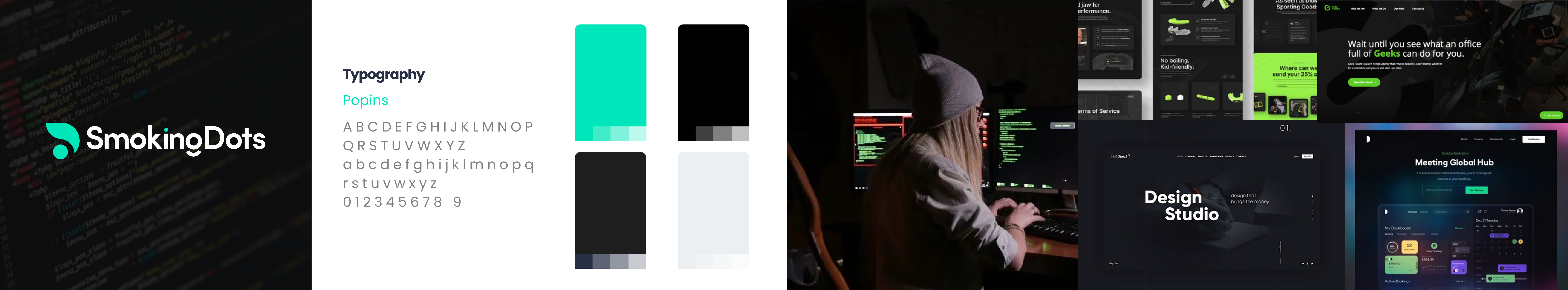
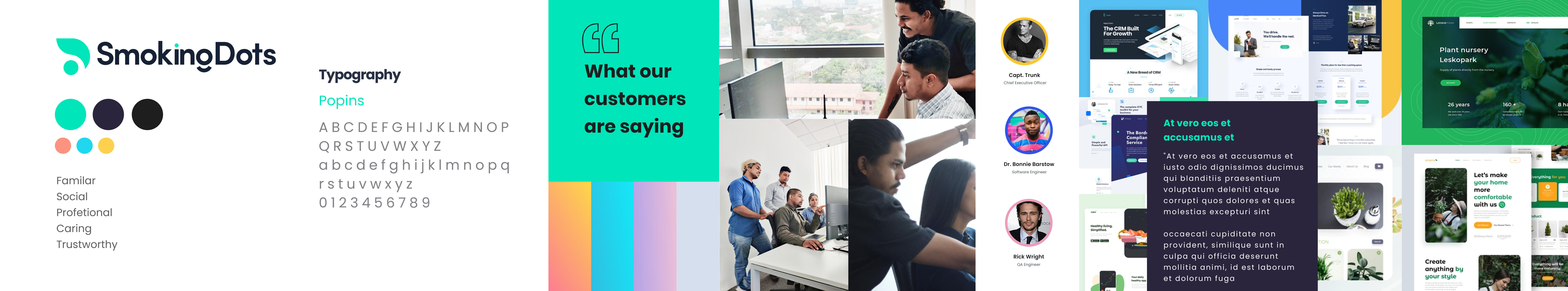
A stylescape is an opportunity to demonstrate to the client how a brand will look and feel. It's a collection of brand assets – colors, typography, images, language tone, design elements etc. – combined together to provide an overall visual aesthetic of a brand.
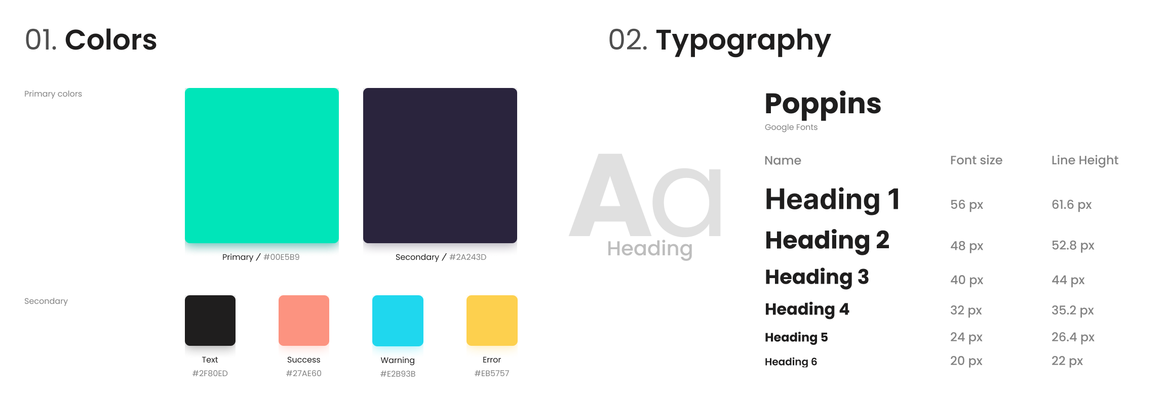
Style guide
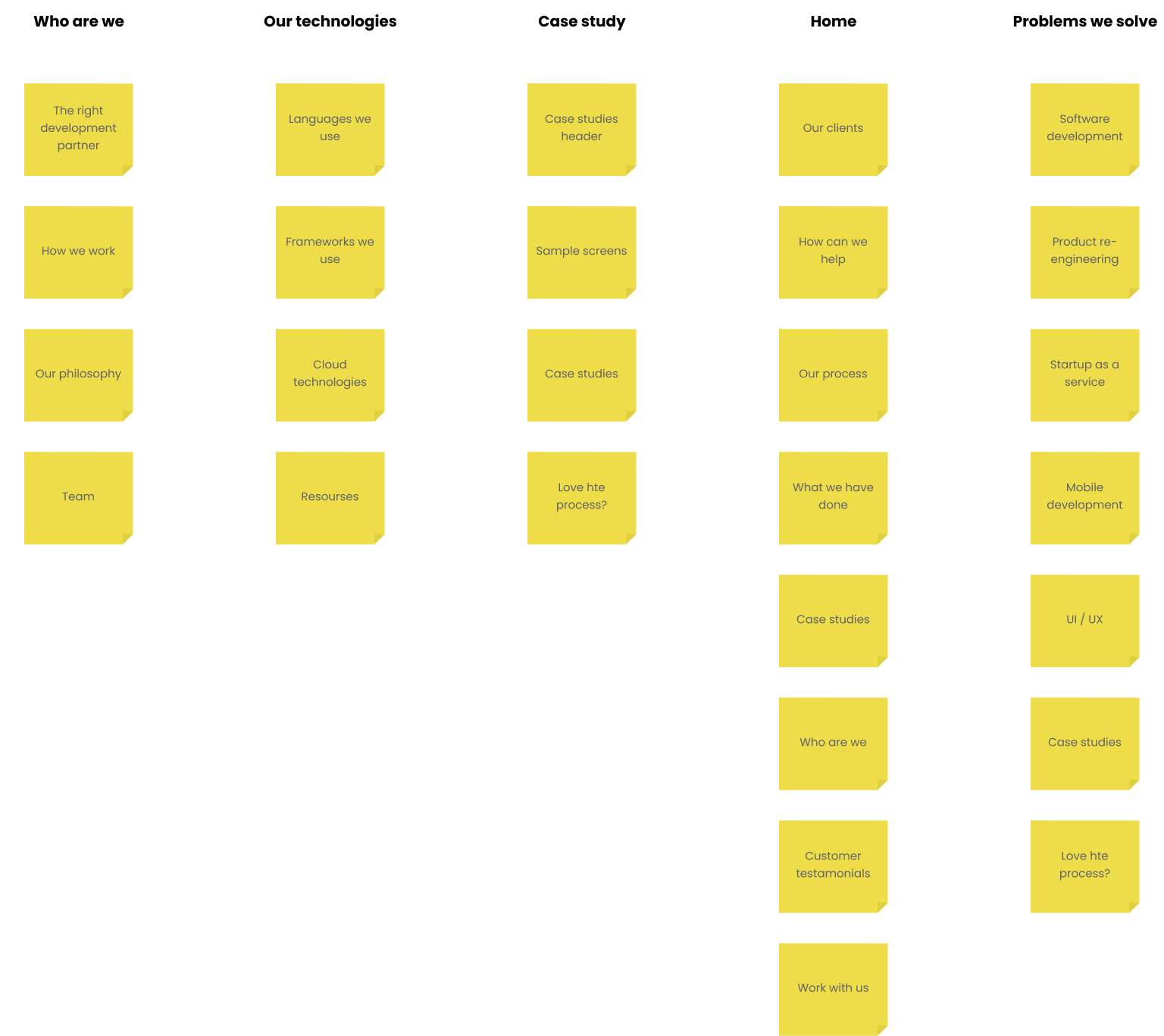
Information architecture
To understand what content should be where a card sorting exercise was conducted with the
stakeholders. We broke down a list of all available information and features. from there we
collectively decided what to keep and to remove. From there we broke all the content under
sections to show pages and sections
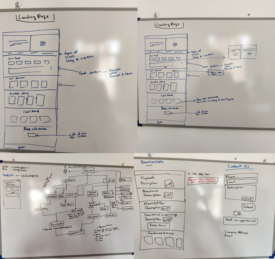
Visual design
From the workshops with the client the user personas, infromation architecture, wireframes
and site map visual designs were created fro the two main stylescapes to iterate through.
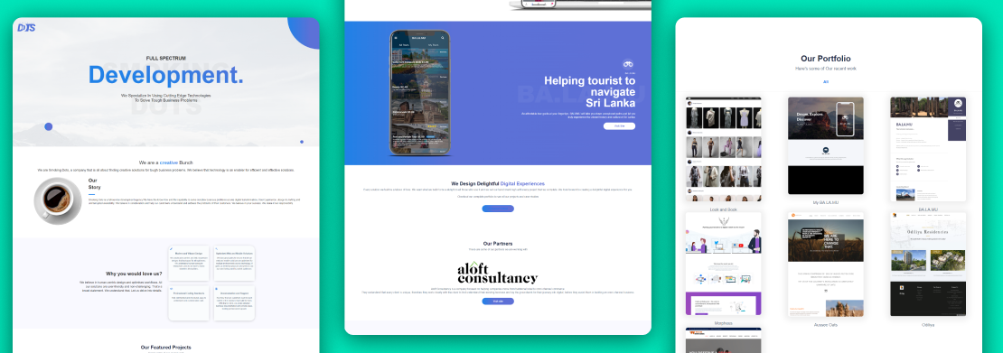
Option one
Option two
From futher discussions with the stakeholders iteration one was considered to be the one to move
forward with. From there I moved on to creating the other pages for the website following the
site structure.
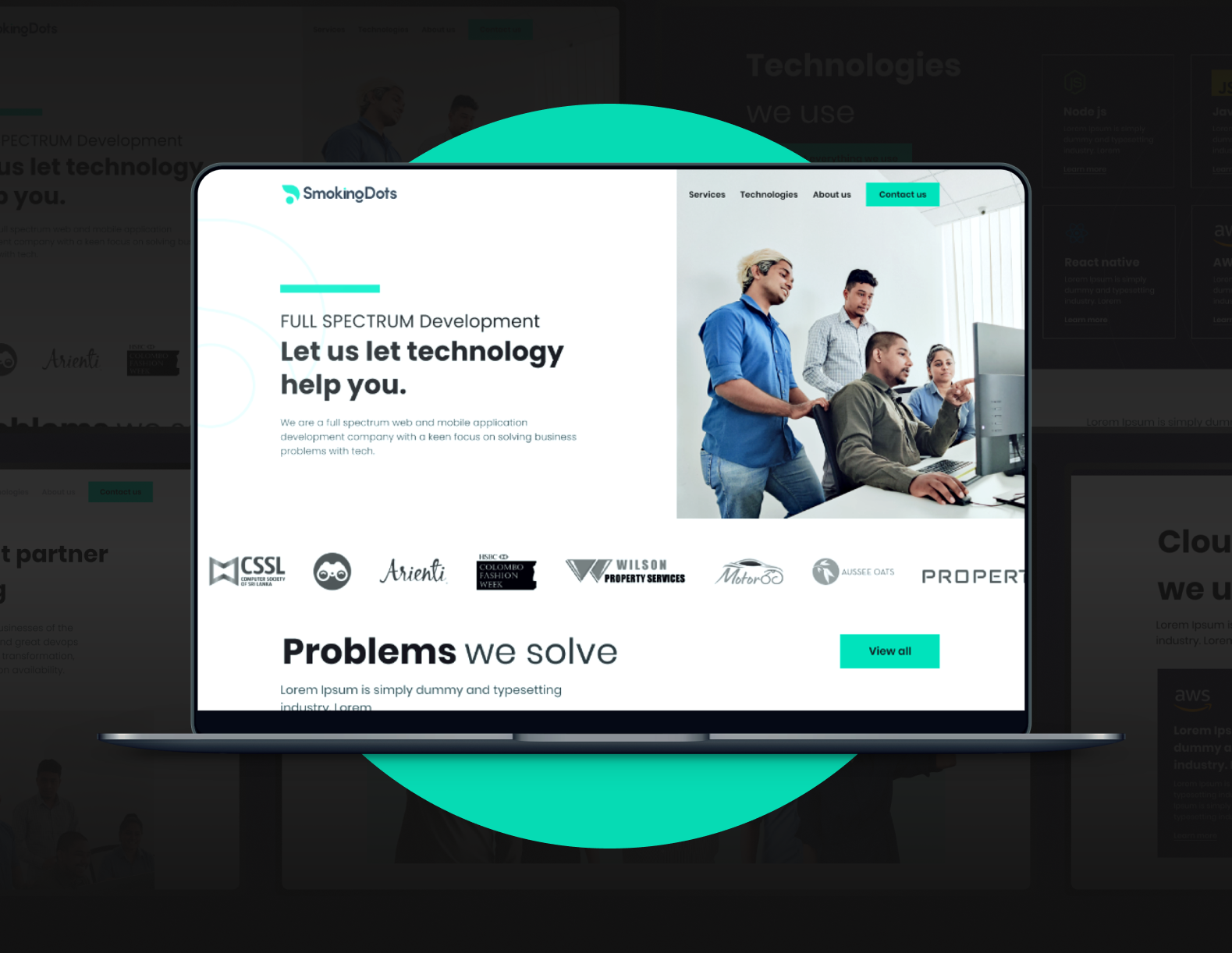
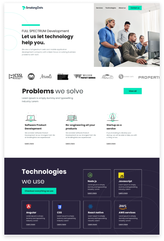
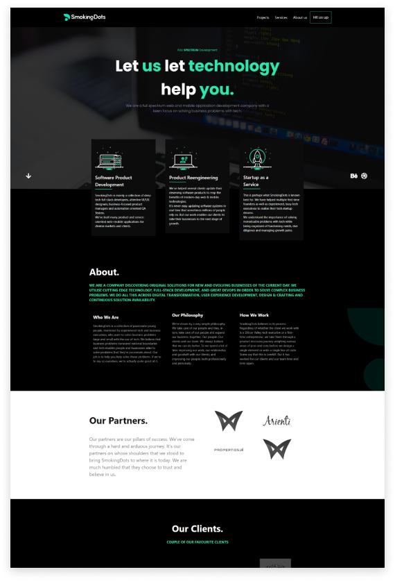
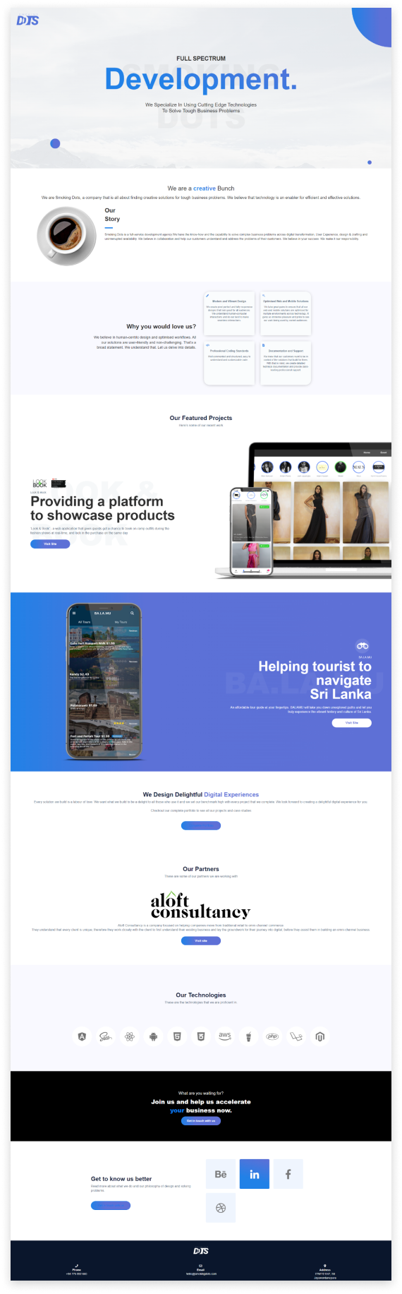
Updated interface
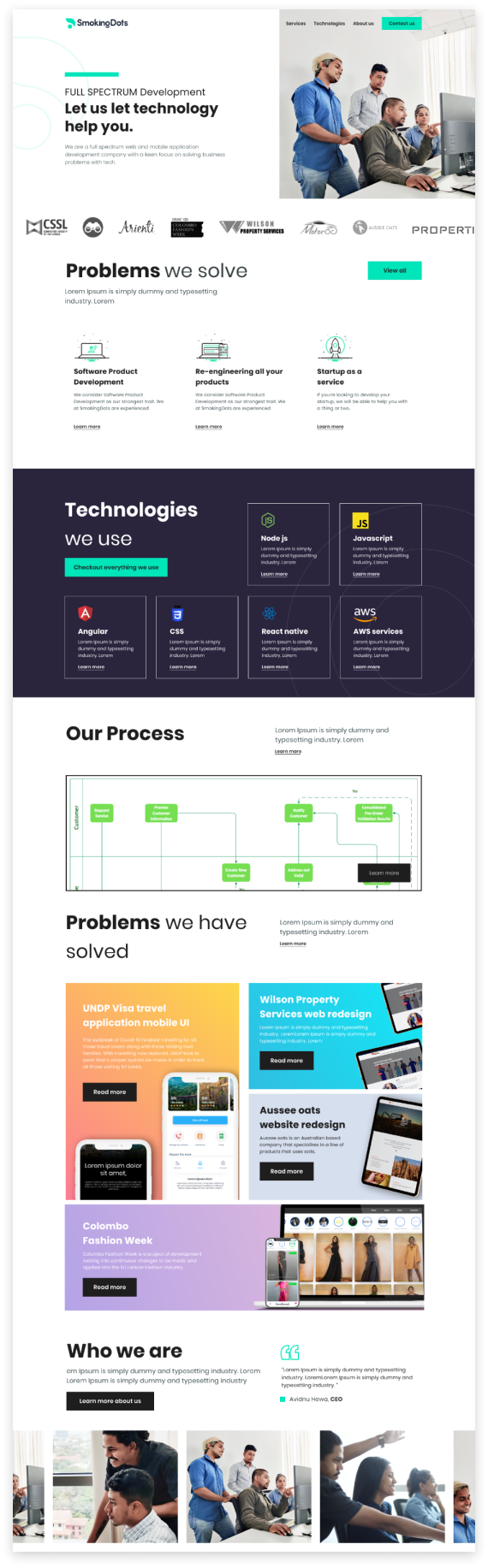
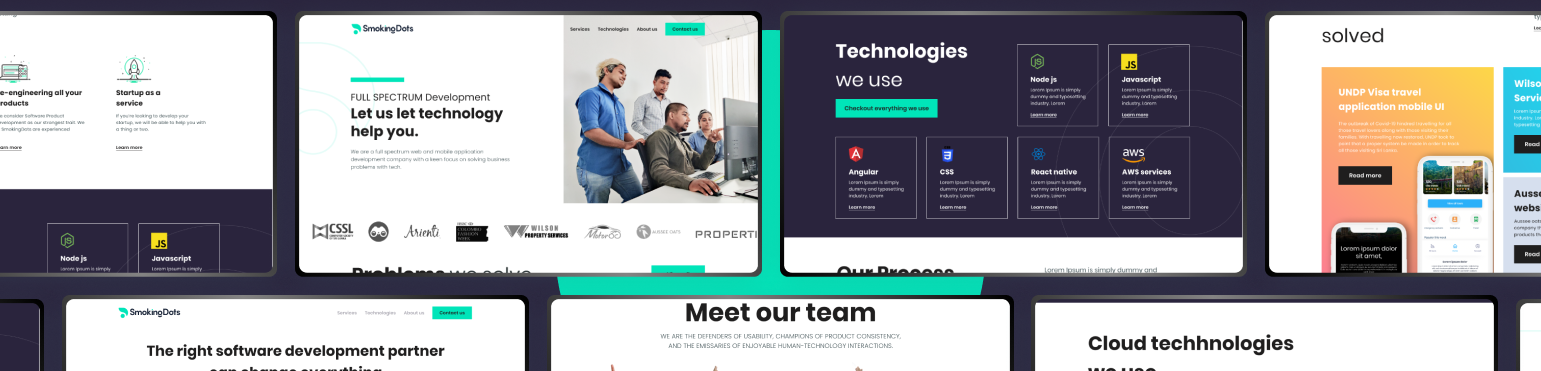
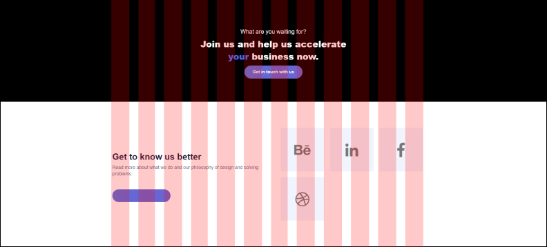
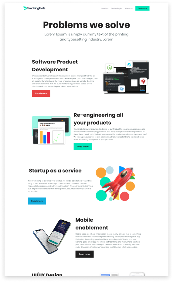
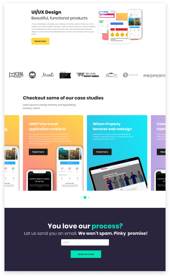
Home page
Problems section
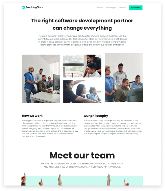
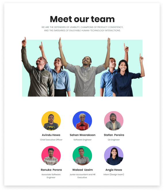
Meet the team
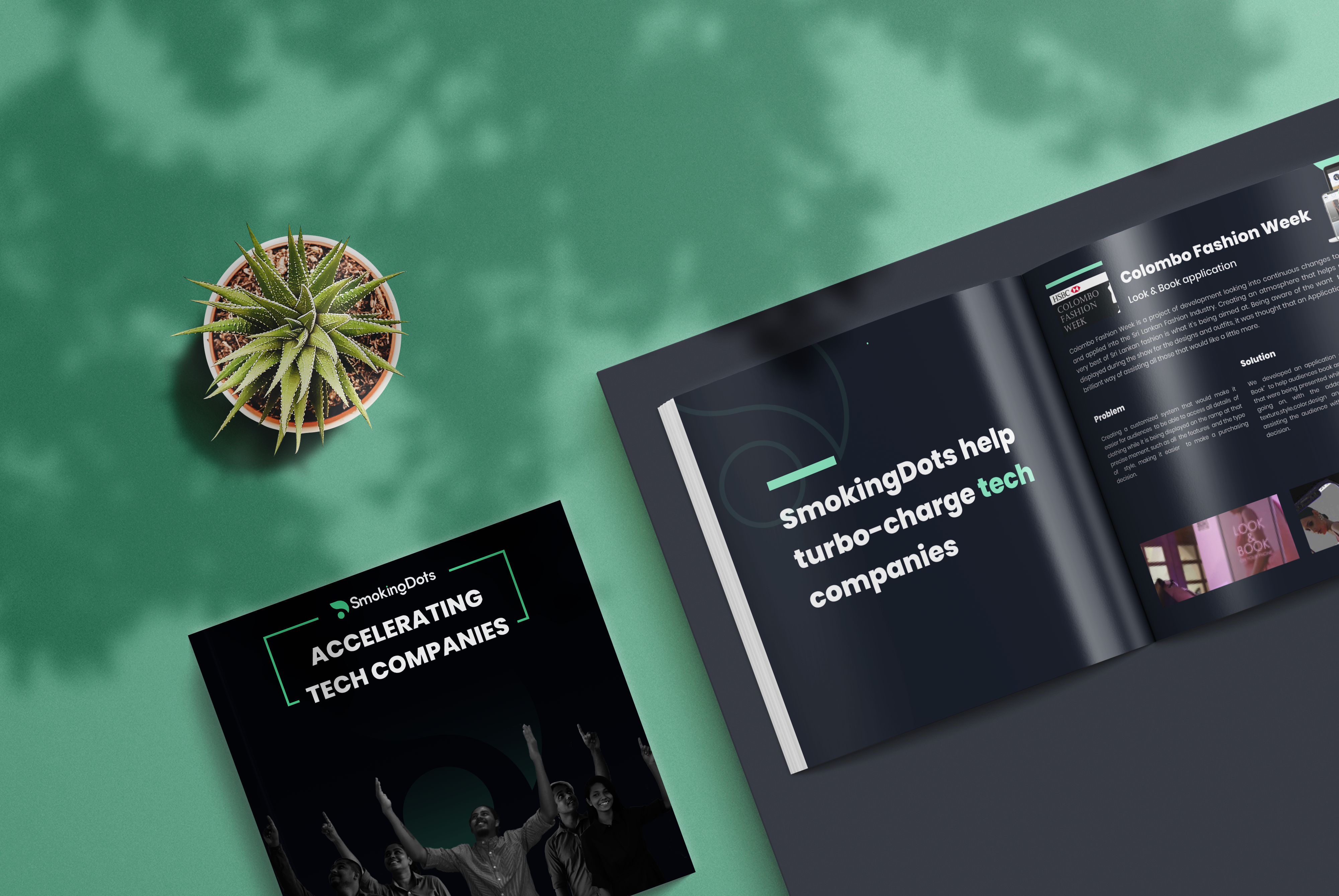
Capabilities deck
Along with the website design a capabilities deck was created for the company in order to share
with prospective clients and can be used as downaldable content
Final Design
From the workshops with the client the user personas, infromation architecture, wireframes
and site map visual designs were created fro the two main stylescapes to iterate through.
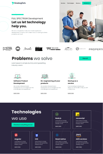
Before
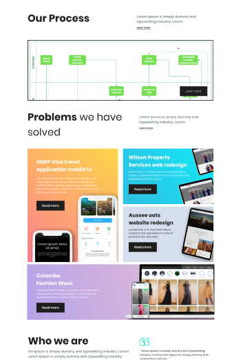
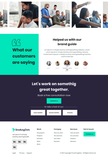
After