Case Study: Smokingdots, Logo redesign
A look at how a logo redesign is conducted, I will showcase the steps I followed and
how the desitions were made for the rebranding of the company look of smokingdots
Problem
The old logo for smokingdots, a young tech startup that is a full spectrum web and
mobile application development company. is having some major flows that are becoming
a hindrance to the brand and the owners
My role
My task was to create a new brand identity without breaking or disturbing the
already gained links and associations and help with a smooth transition. I have to
understand what makes the current logo not work, understand what the customer base
is and come up with a concept that will help them mitigate the problems of the old
logo
What makes a logo.. good?
Before I go any further I needed to understand what makes a logo "good" how can one
explain what a good logo is knowing this I will be able to understand the
shortcomings of the current logo
- A job of a logo is never to explain its to identify
- A good logo should be appropriate to the content
- A good logo should be legible at all sizes
- A logo needs to be simple enough to be easily memorable
Issues of the current logo
From the baseline we defined let's understand the issues of the current logo
- The logo is not easily readable
- In small scale the logos simply reads dots as the "smoking" part is too thin
- The logo is not simple there are too many effects such as the negative space, making things italic, having thin vs thick typefaces
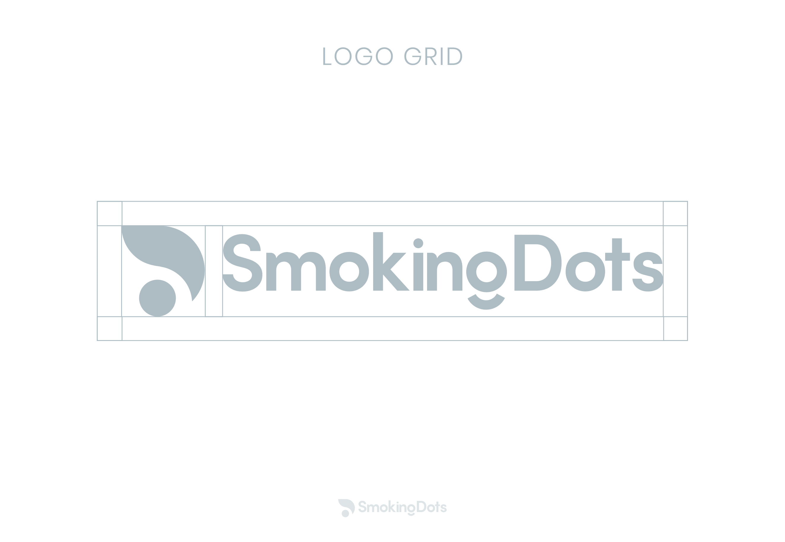
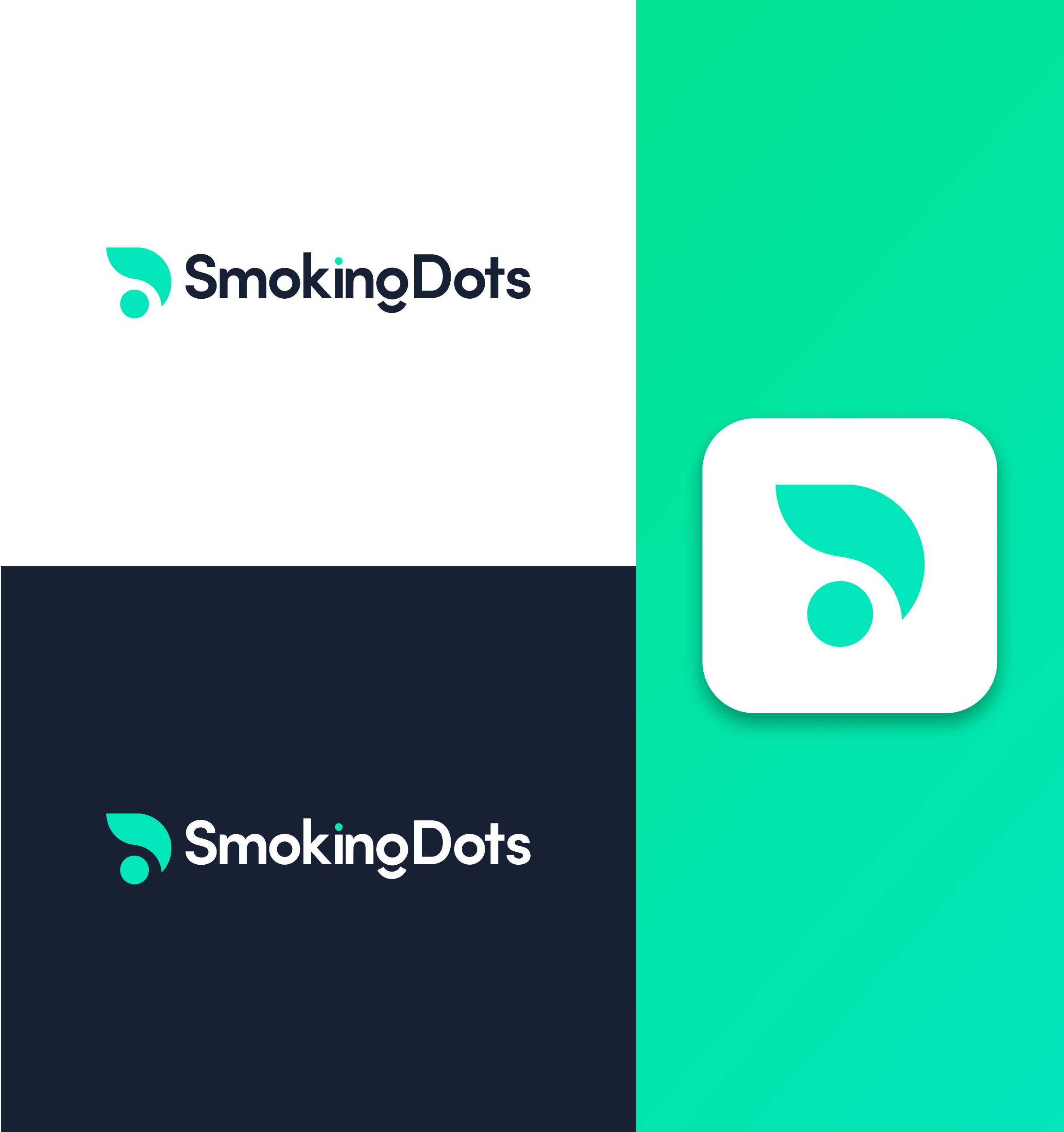
Introduction of a logo mark
Having a logo mark seemed to be the best way to go forward as the word "Smokingdots" was too
long to be added without making the logo too complicated. By introducing a logo mark I will be
able to make sure the brand is recognizable just with the logo mark and the company owners can
easily choose which places will just need the mark and which will need the full Logo
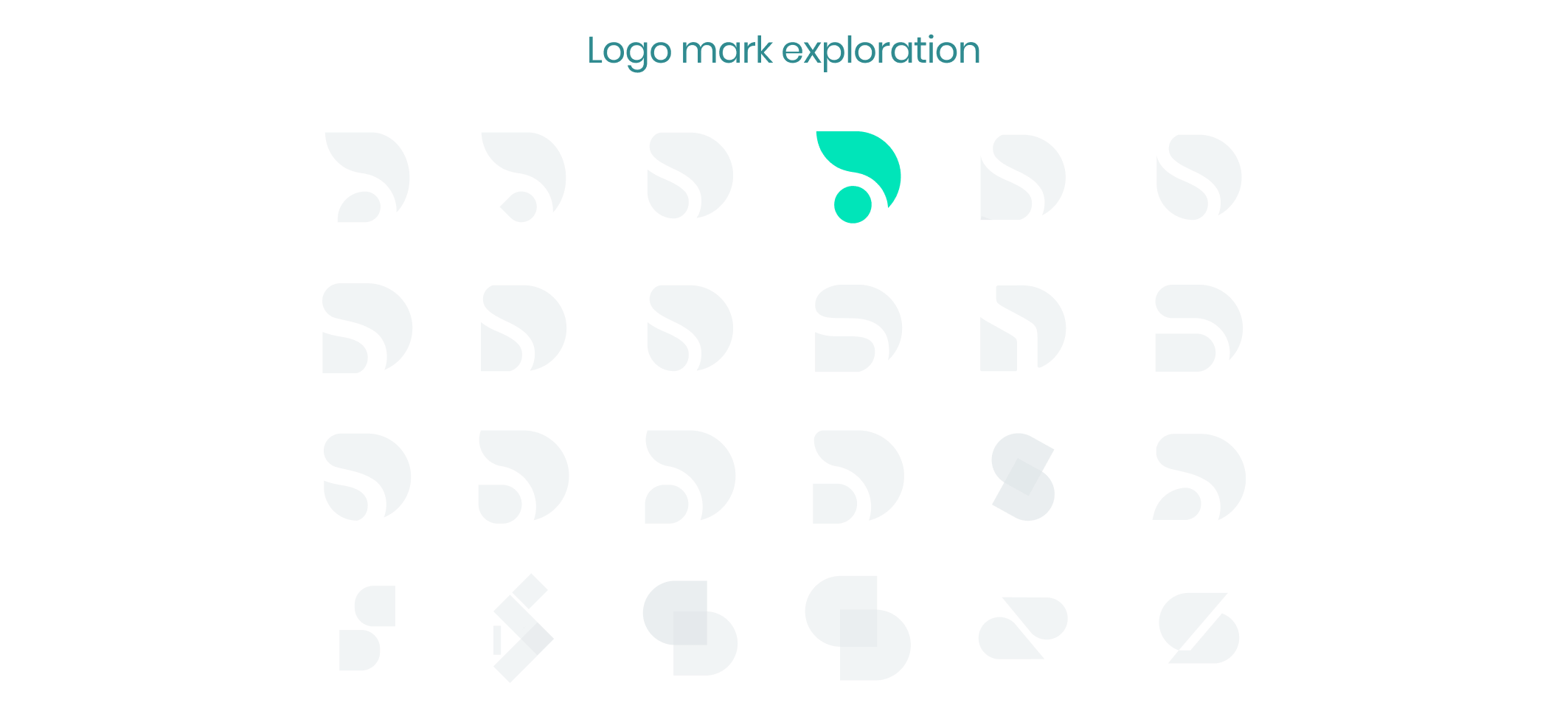
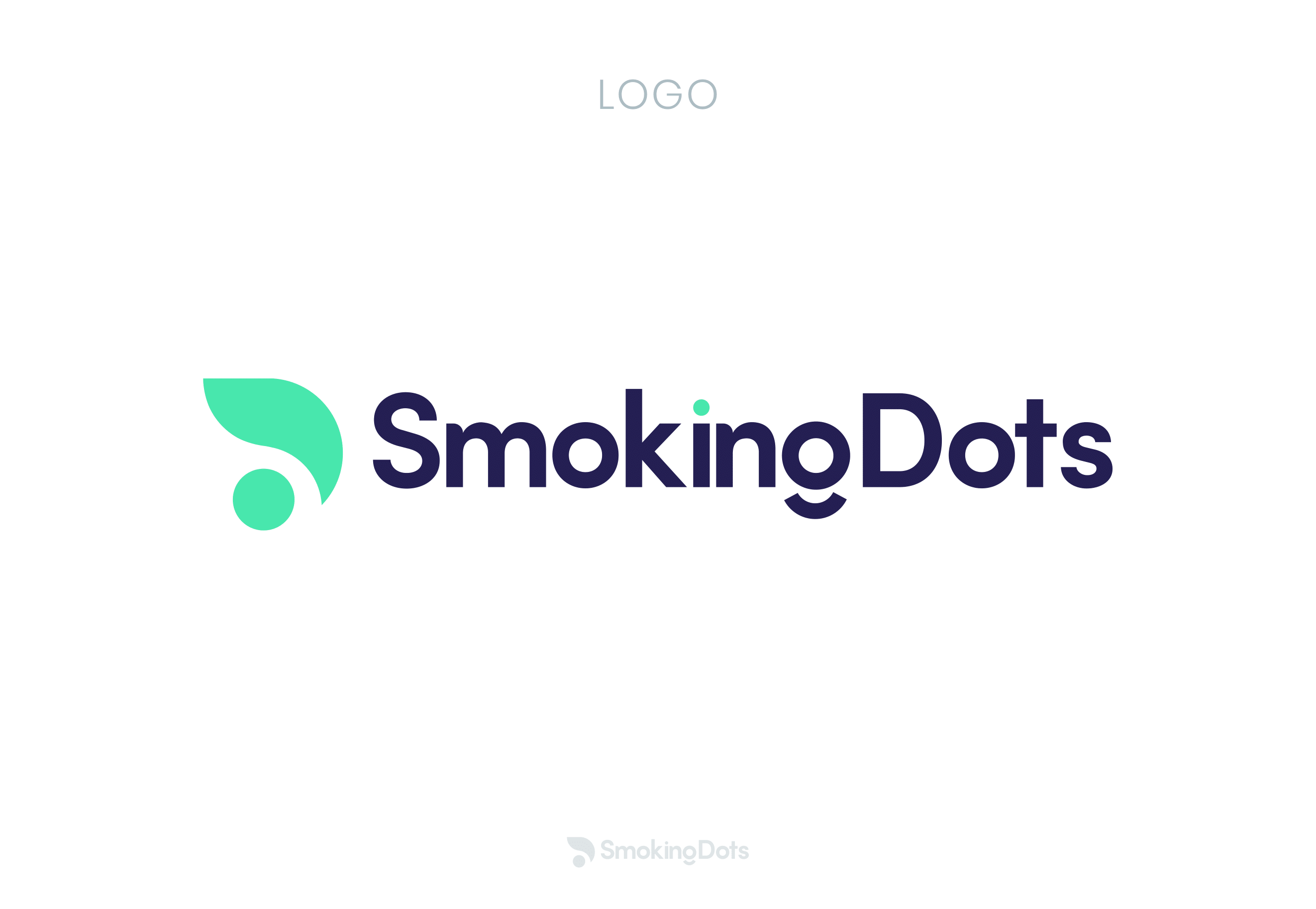
Anatomy of the Smokingdots Logo
The logo mark was constructed using the "S" and the "D" in smoking dots and using the
negative spaces that were created when having the two letters together created a very
simple logo mark that is easily recognizable and understandable and it created the look
of a dot with a smoke symbol coming out of it
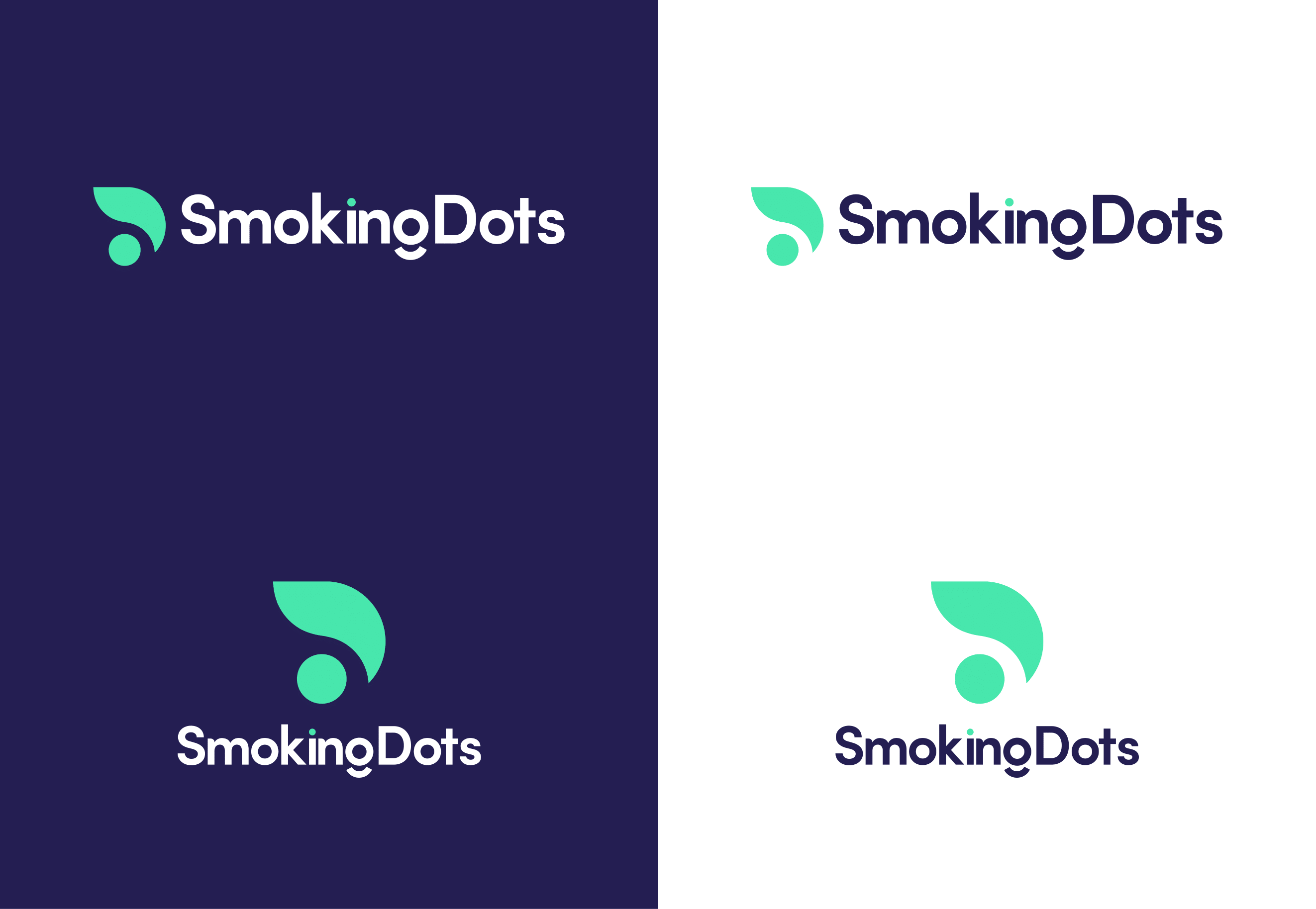
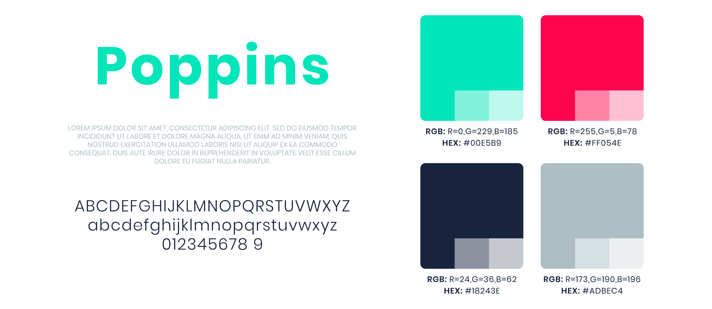
Color exploration and font
When picking the best color to go with the brand I decided to use the main three colors one
might see on a coding screen the green red and dark blue which made it so that anyone that sees
the logo and knowing it is a software company was able to associate the logo with some avenue of
programming. Then the colors were adjusted to have better contrast
Logo usage