A study on logo design for a coffee shop
What is ceylon coffee
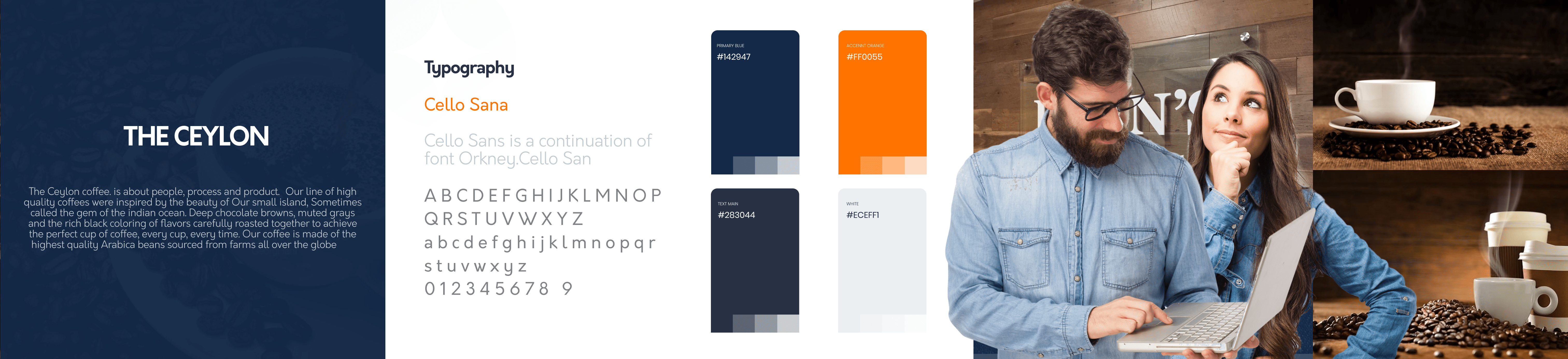
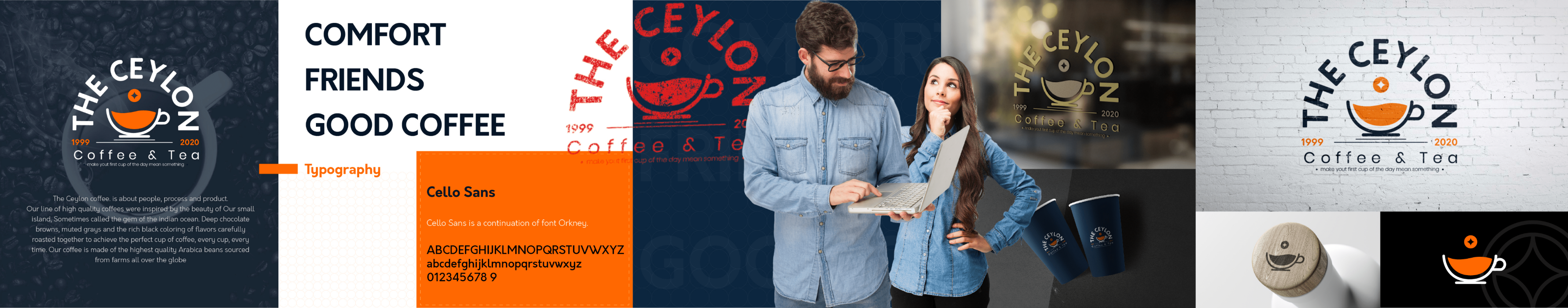
The Ceylon coffee. is about people, process and product.
their line of high quality coffees were inspired by the beauty of the tropical
island of Sri Lanka, Sometimes called the gem of the indian ocean. Deep chocolate
browns, muted grays and the rich black coloring of flavors carefully roasted
together to achieve the perfect cup of coffee
Design Challenge
The Ceylon coffee. is about to move to a new stage in their business since they
started 1999 this will be considered as the first redesign. And since the owners are
expanding from SriLanka to other countries the need for a better design system is
apparent. The designer is in charge of making sure the new branding matches the new
age style while being true to the timeless aspect of the product
Stylescapes ( Pre Logo)
Stylescapes were created for the brand in order to understand what kind of a look and feel is
best to move forward
Initial Logo Sketches
Different logo Sketches were explored to see which will be the one that will fit the brand

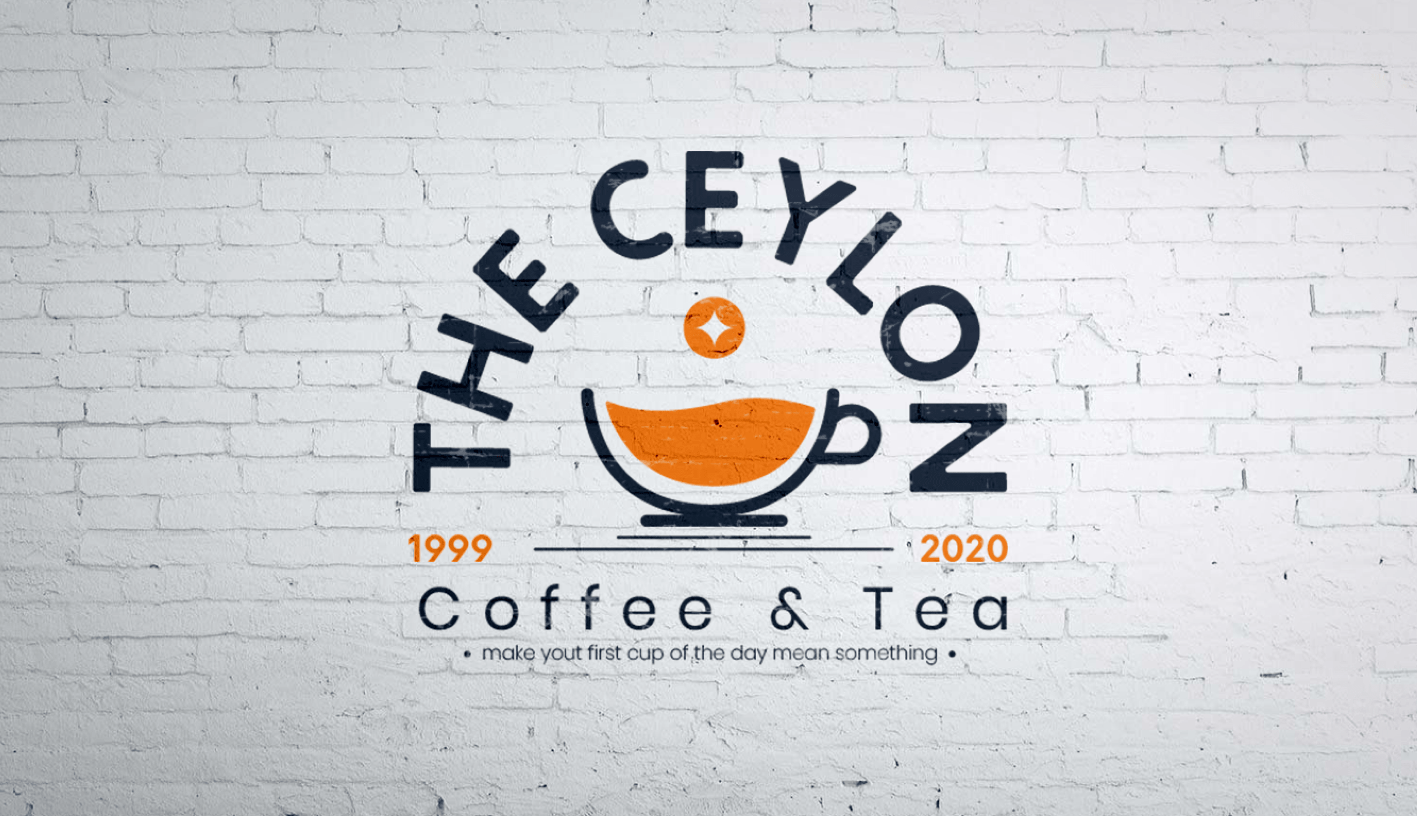
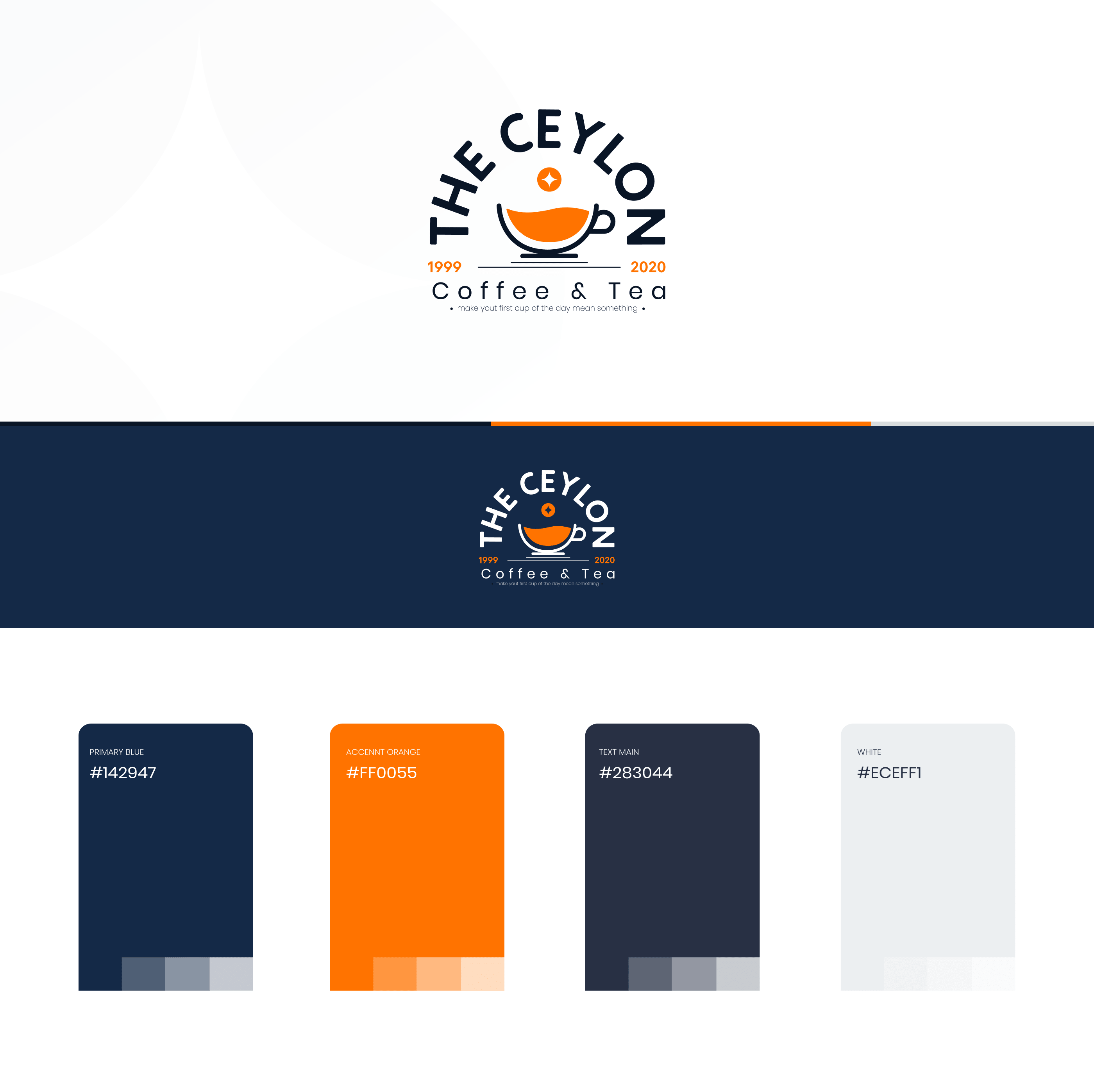
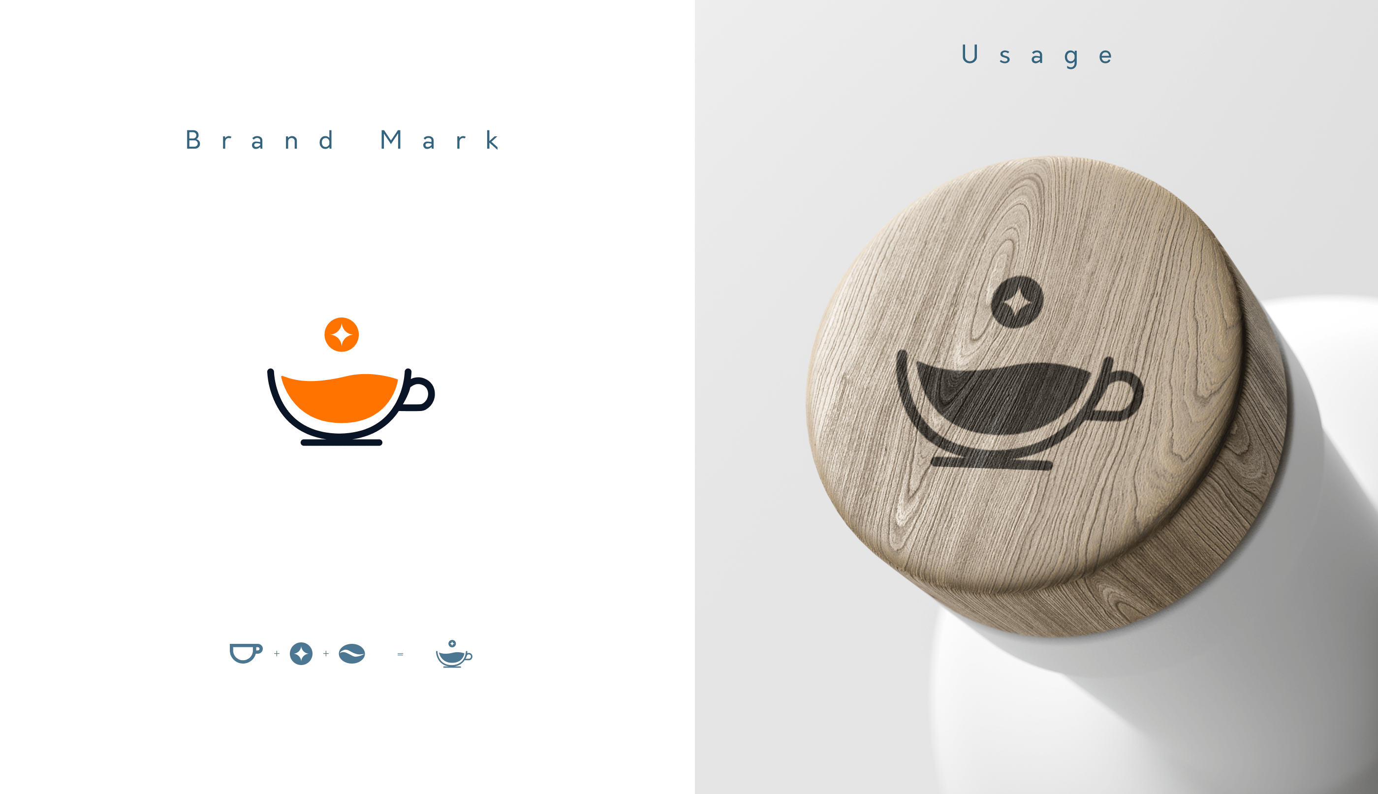
Anatomy of THE CEYLON LOGO
After coming down to the two final logos i decided to pick the rounder lockup with the
brand
mark in the middle. This logo provides an old american timeless design look while the
brand mark
and the addition of the orange color makes the logo useful for modern times. And this
logo
tested well as a larger format and a smaller format, For really small materials just the
brand
mark can be used.
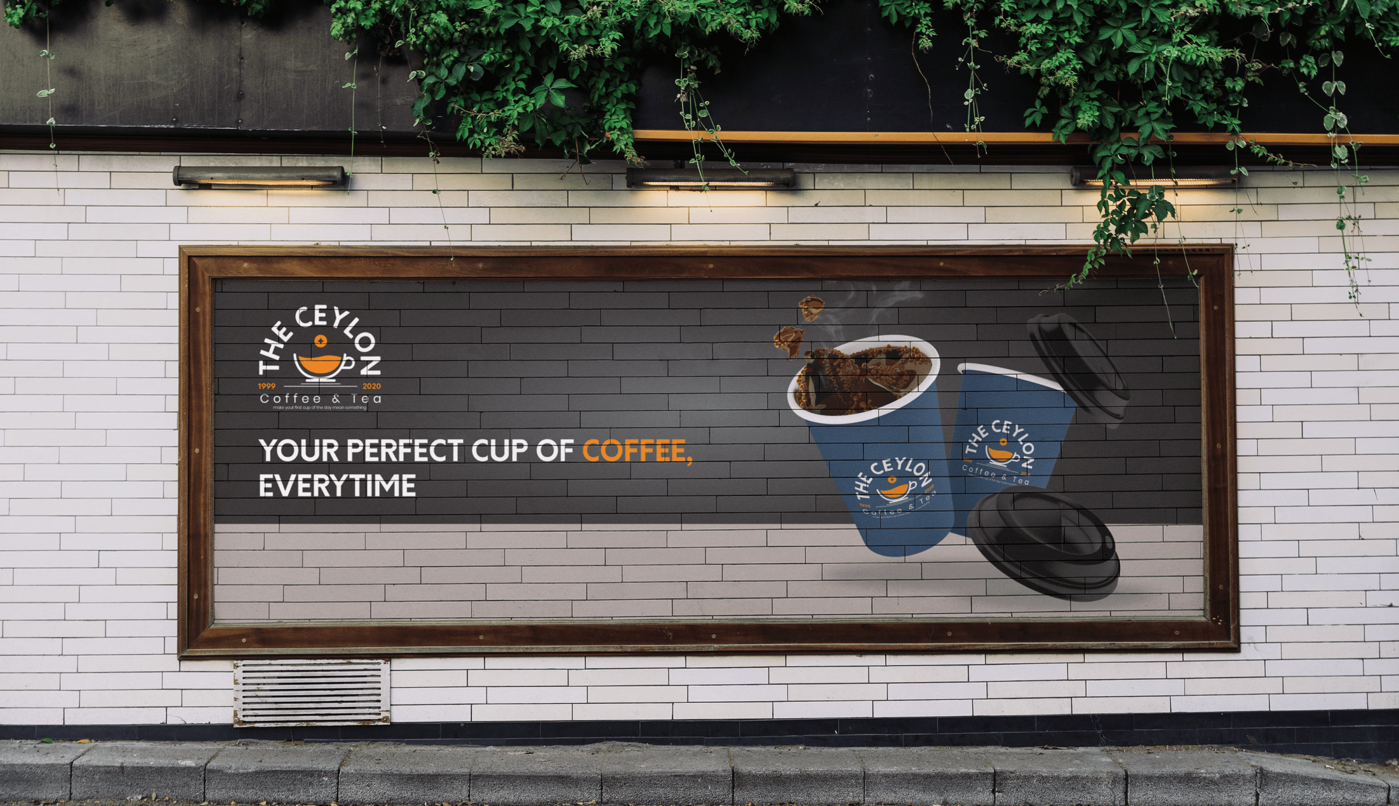
Stylescape with the finalized logo
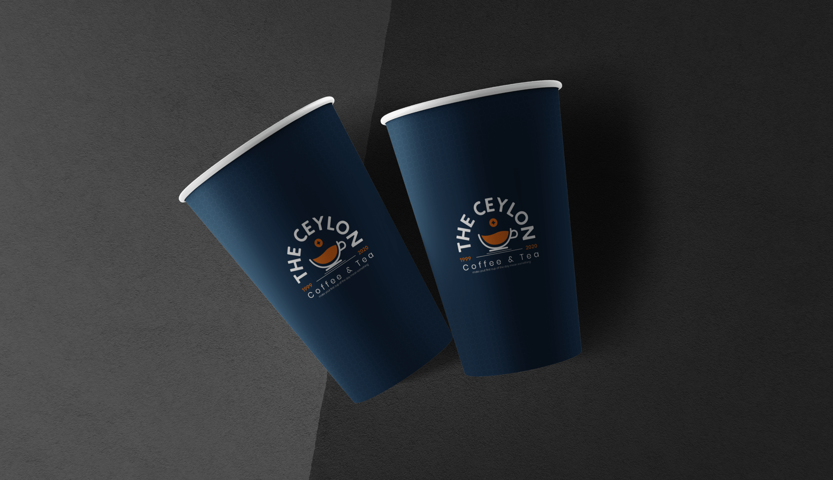
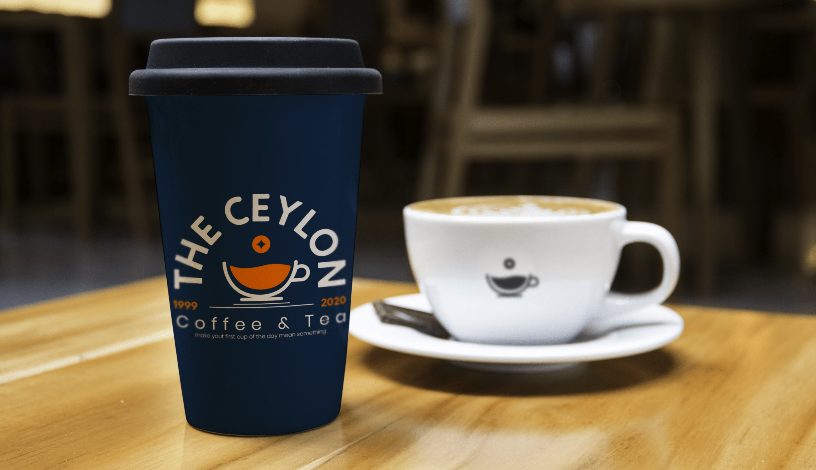
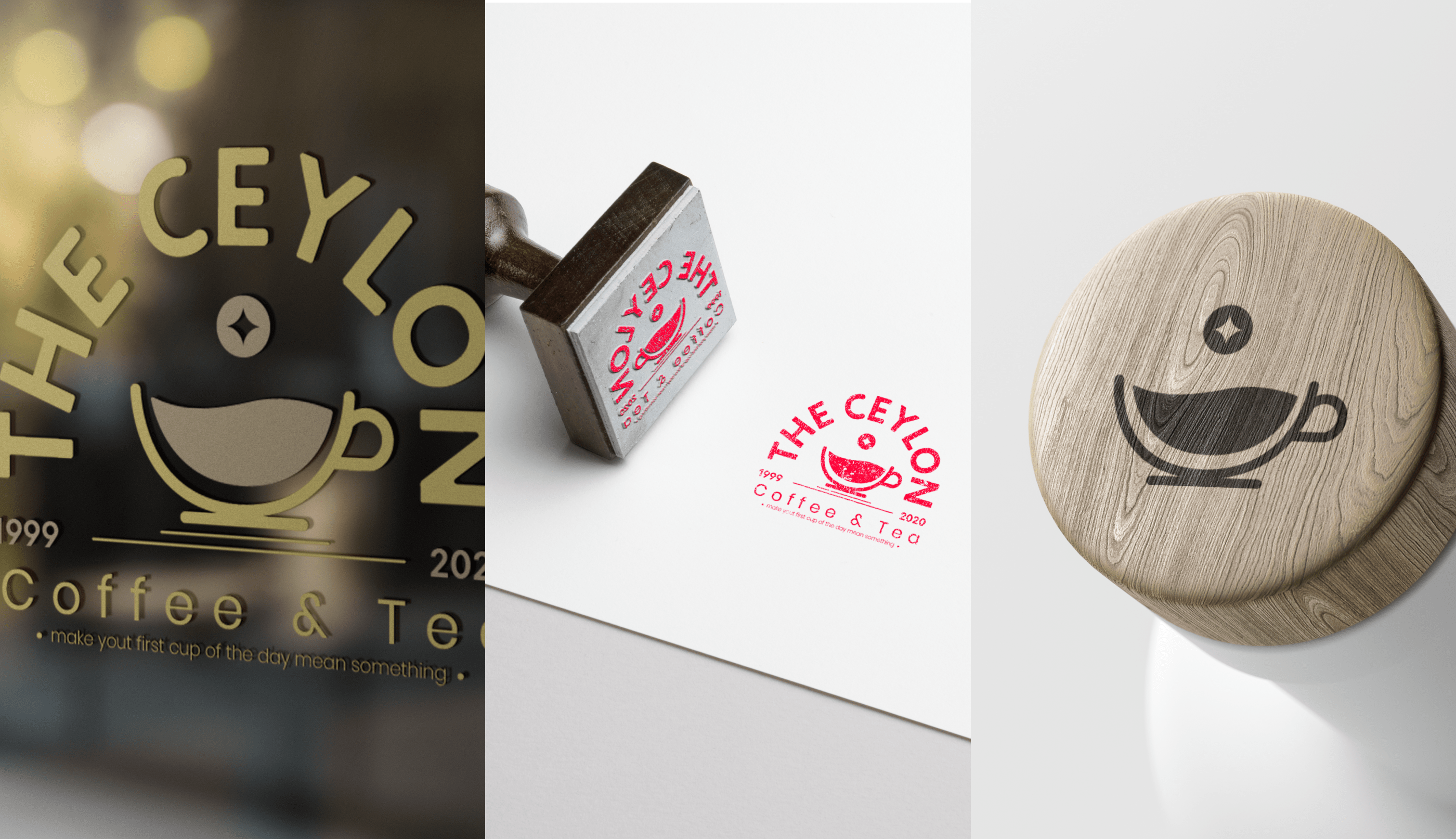
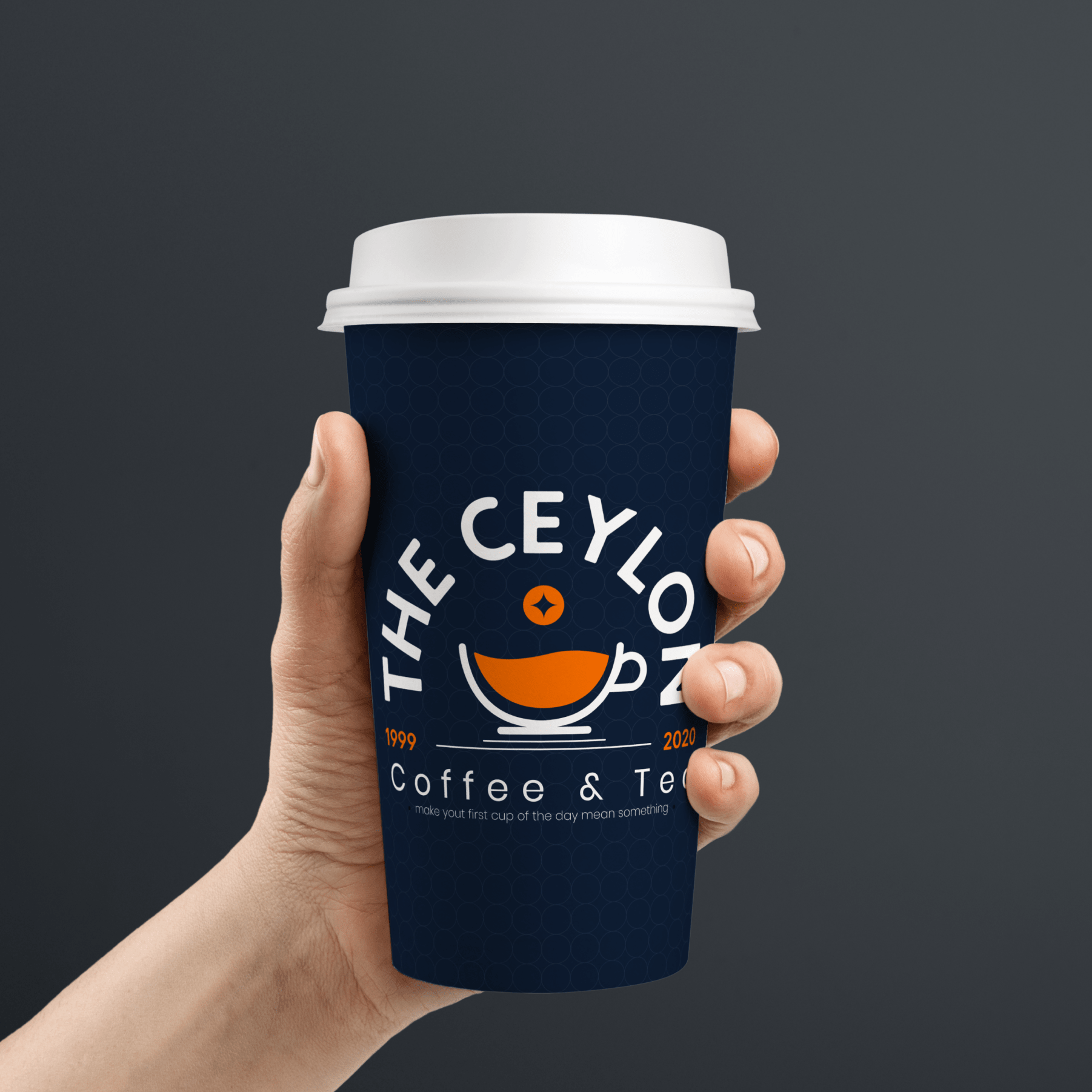
Logo usage
The final logo was added into mockups to understand how the logo would look in small and large
scale. The main point of a logo is to be legible and identify the brand.